The Beacon
A Benchmark for Sustainable Living
Branding
Digital Experience
Disciplines
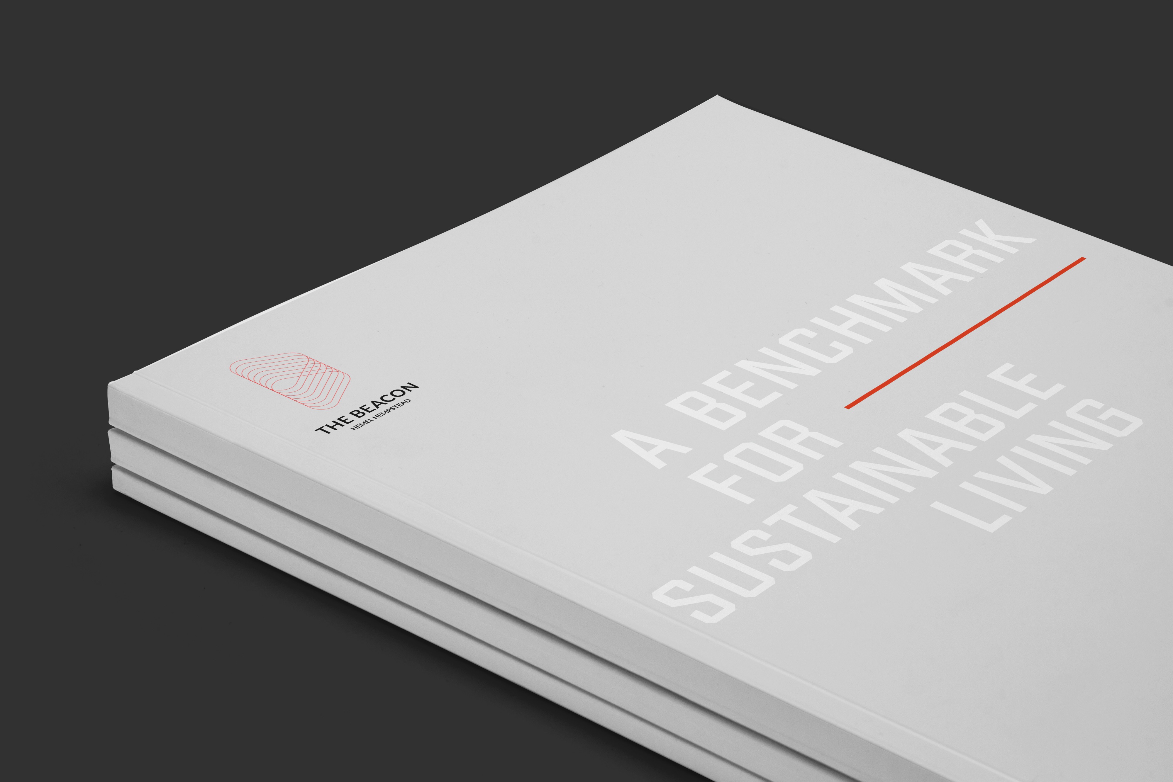
Brand Guidelines
Brand Identity
Campaign
Creative Direction
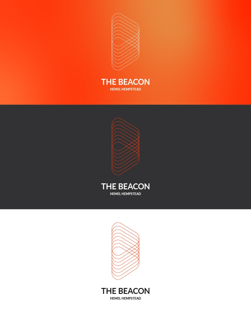
Logo Design
Web Design
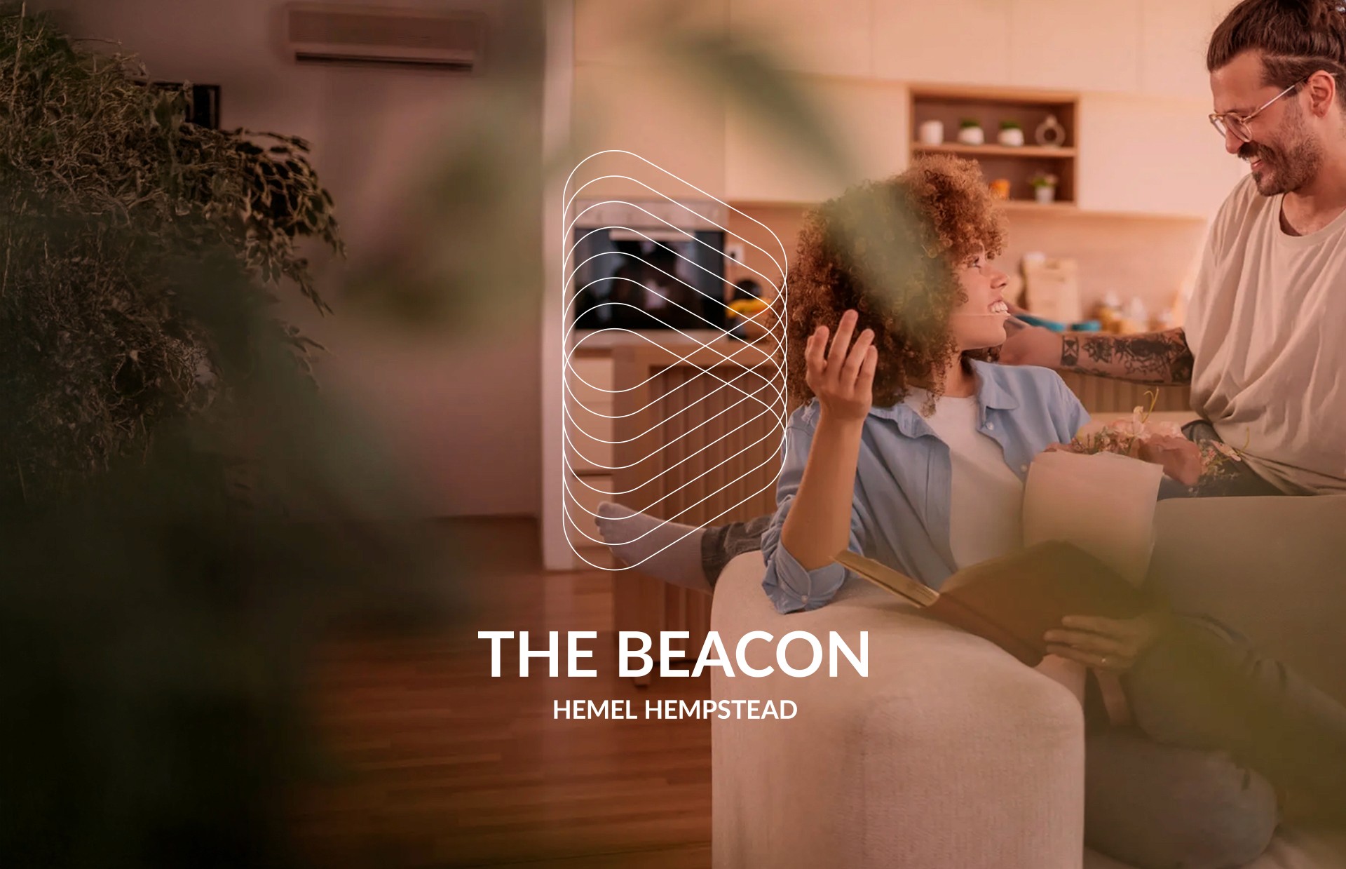
The Beacon was an ambitious new residential development with an extraordinary proposition: the aspiration to become the world's most sustainable place to live.
THE CHALLENGE
The risk was a brand that looked like every other 'eco-friendly' development generic green palettes, leaf imagery, sustainability claims floating above uninspiring architecture. That kind of visual language actively undermines the claim it's trying to support.
If the brand felt like marketing, the sustainability ambition would feel like marketing too. The identity needed to make the development's environmental leadership feel structural and inevitable built into the DNA of the place rather than applied on top of it.
THE APPROACH
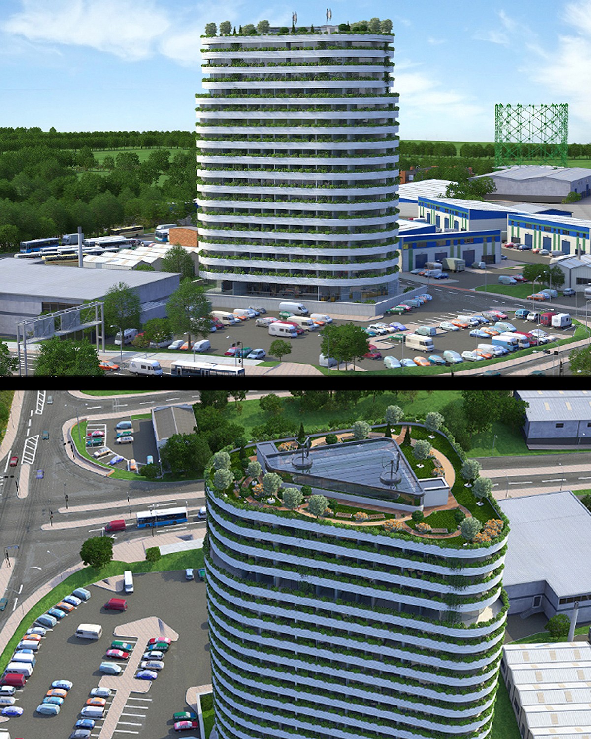
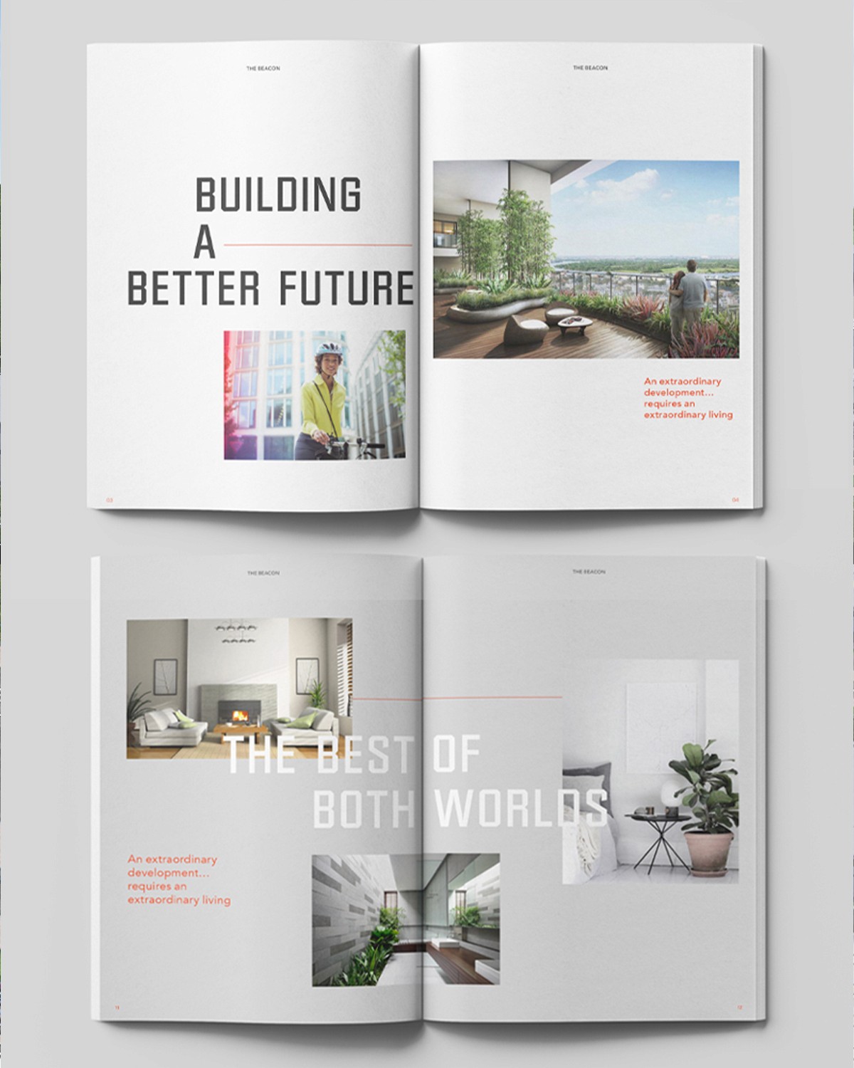
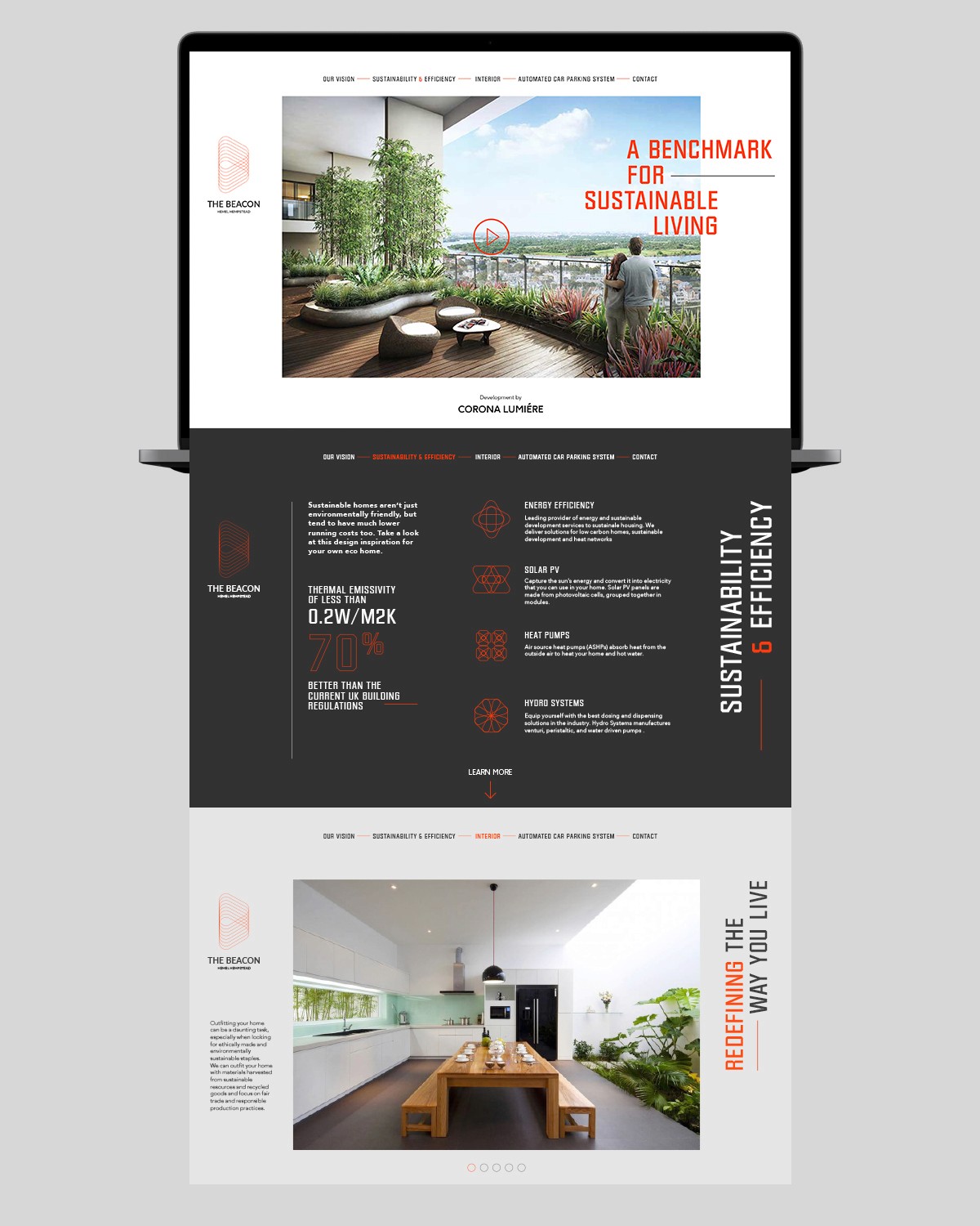
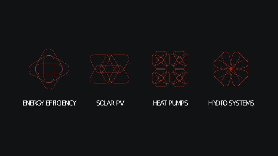
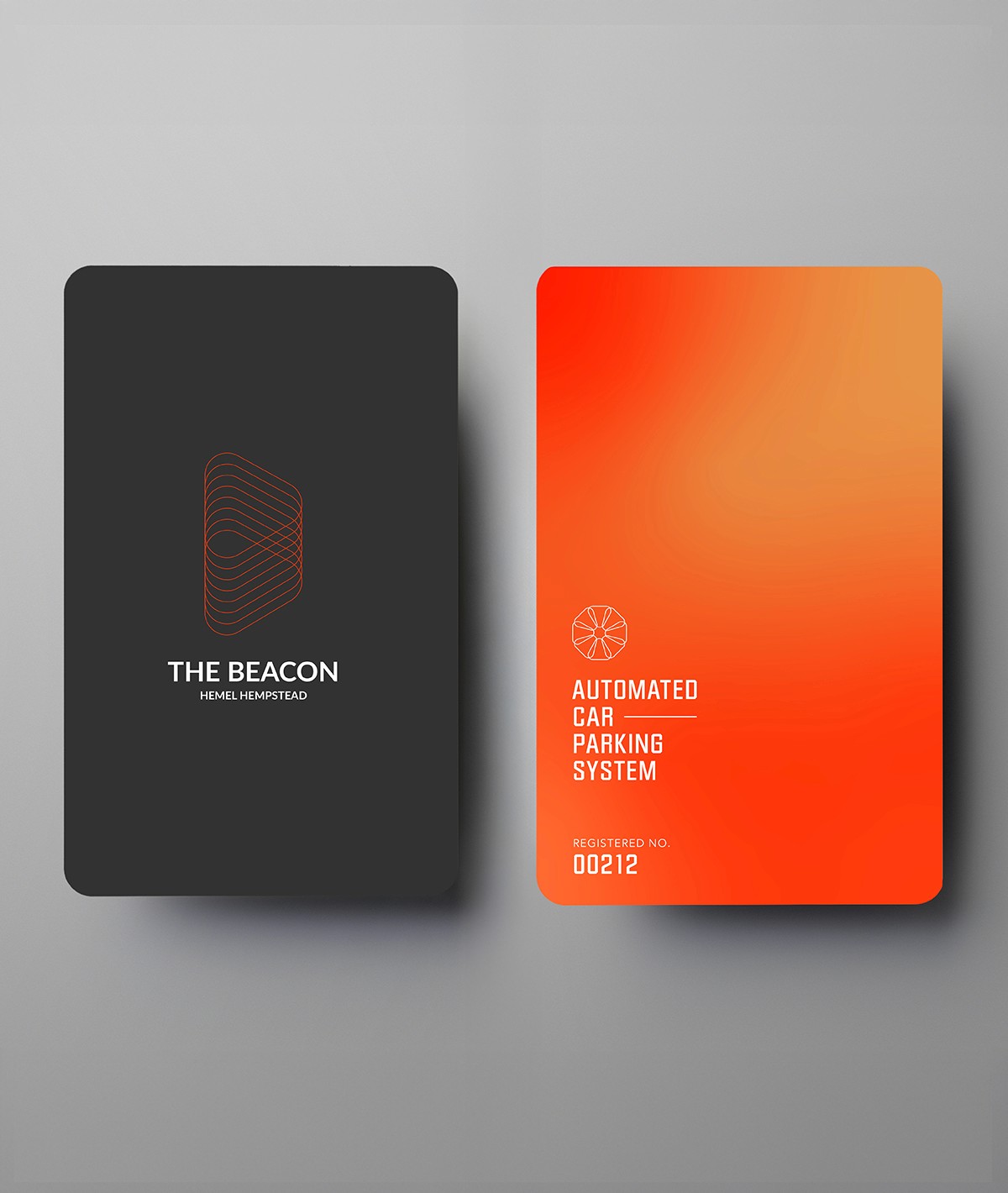
The design decision was to root the entire identity in the architecture of the building itself. The distinctive shape of The Beacon became the foundation of the visual system a unifying structural device that appeared across layouts, graphic elements, and composition.
This meant the brand and the building were inseparable. You couldn't look at the identity without seeing the place. Sustainability was treated as a design principle, not a campaign communicated through clarity, restraint, and longevity in every visual decision rather than through explicit green messaging.
The result is a calm, confident identity that earns belief through consistency of conviction rather than volume of claims.
THE OUTCOME
Attract buyers and residents who want to live a genuinely sustainable life not just buy into a sustainability narrative. These are discerning people who will see through performative branding immediately.
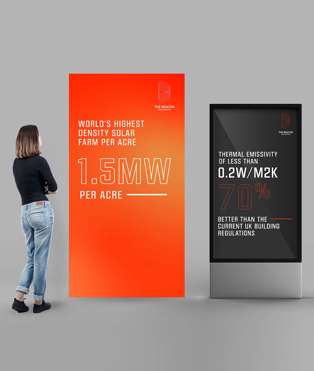
The identity also needed to support planning, investment, and press coverage for a development making landmark-level claims. Every external-facing touchpoint had to reinforce rather than undermine the credibility of the environmental proposition.
The Beacon was an ambitious new residential development with an extraordinary proposition: the aspiration to become the world's most sustainable place to live.
THE CHALLENGE
The risk was a brand that looked like every other 'eco-friendly' development generic green palettes, leaf imagery, sustainability claims floating above uninspiring architecture. That kind of visual language actively undermines the claim it's trying to support.
If the brand felt like marketing, the sustainability ambition would feel like marketing too. The identity needed to make the development's environmental leadership feel structural and inevitable built into the DNA of the place rather than applied on top of it.
THE APPROACH
The design decision was to root the entire identity in the architecture of the building itself. The distinctive shape of The Beacon became the foundation of the visual system a unifying structural device that appeared across layouts, graphic elements, and composition.
This meant the brand and the building were inseparable. You couldn't look at the identity without seeing the place. Sustainability was treated as a design principle, not a campaign communicated through clarity, restraint, and longevity in every visual decision rather than through explicit green messaging.
The result is a calm, confident identity that earns belief through consistency of conviction rather than volume of claims.
THE OUTCOME
Attract buyers and residents who want to live a genuinely sustainable life not just buy into a sustainability narrative. These are discerning people who will see through performative branding immediately.
The identity also needed to support planning, investment, and press coverage for a development making landmark-level claims. Every external-facing touchpoint had to reinforce rather than undermine the credibility of the environmental proposition.