SOTTINI
A Tradition of Excellence
Strategy
Branding
Disciplines
Campaign
Creative Direction
Sottini is a high-end bathroom brand competing in one of the more difficult premium product categories: design-led home interiors, where differentiation is genuinely hard, margins are squeezed by the volume end of the market, and brand equity is the primary commercial lever available to a premium player.
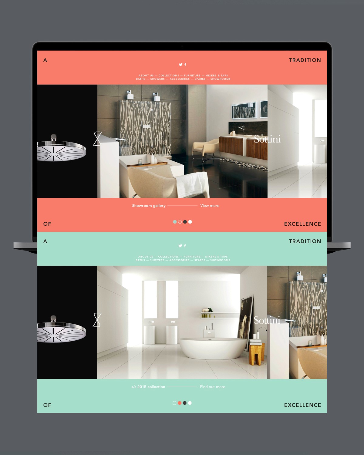
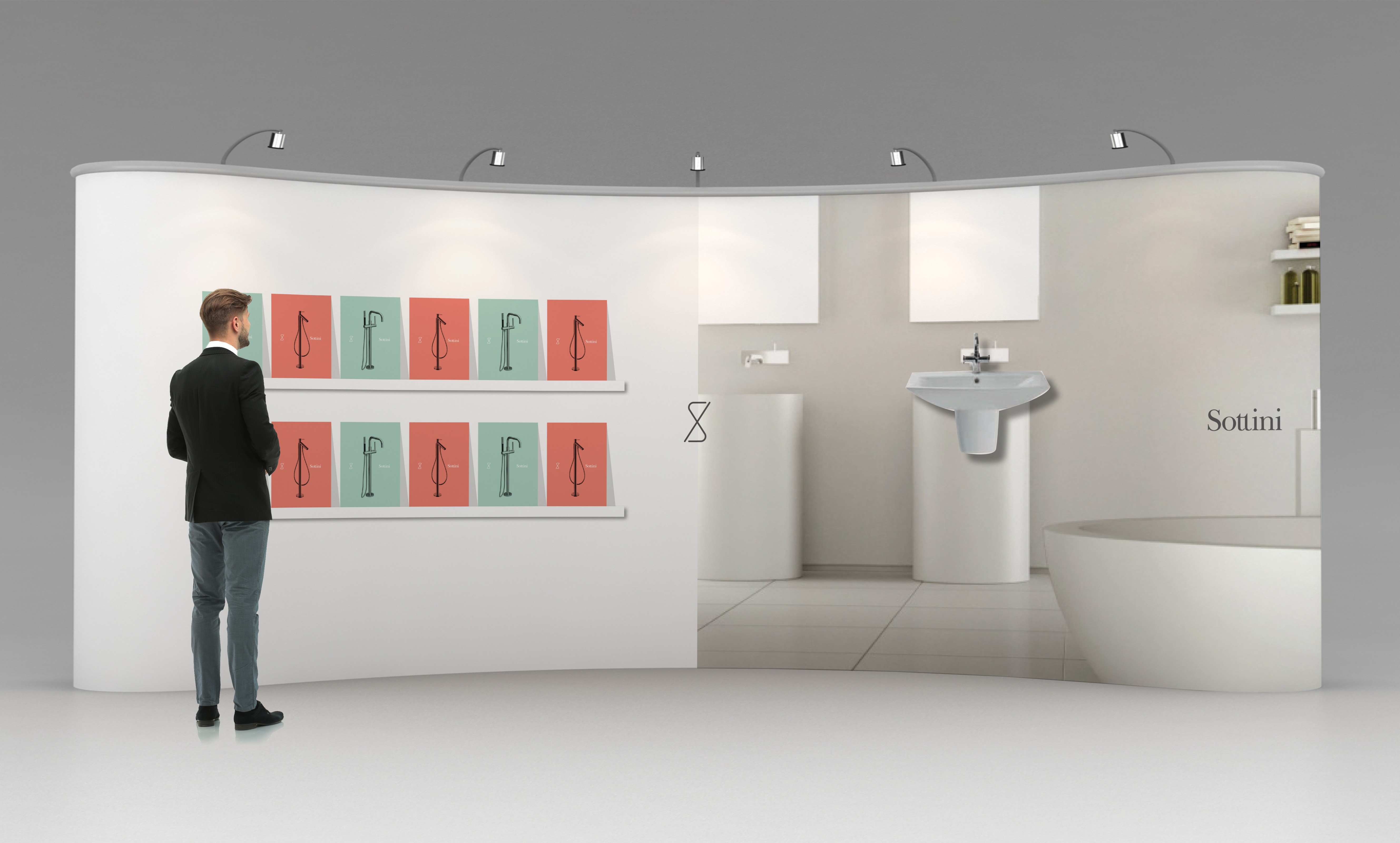
The brief was to build an identity capable of competing against established luxury bathroom brands in retail environments, digital spaces, and architect/specifier conversations all of which require different registers but must be held together by a single coherent system.
THE CHALLENGE
Premium bathroom brands face a persistent threat: visual trends move faster than product development cycles. A brand built on the current aesthetic of luxury whatever that happens to be is already dating before the product range refreshes.
The risk for Sottini was an identity that looked premium today but required expensive reinvention in three years. The commercial cost of a brand that can't age well is significant for a product business.
THE APPROACH
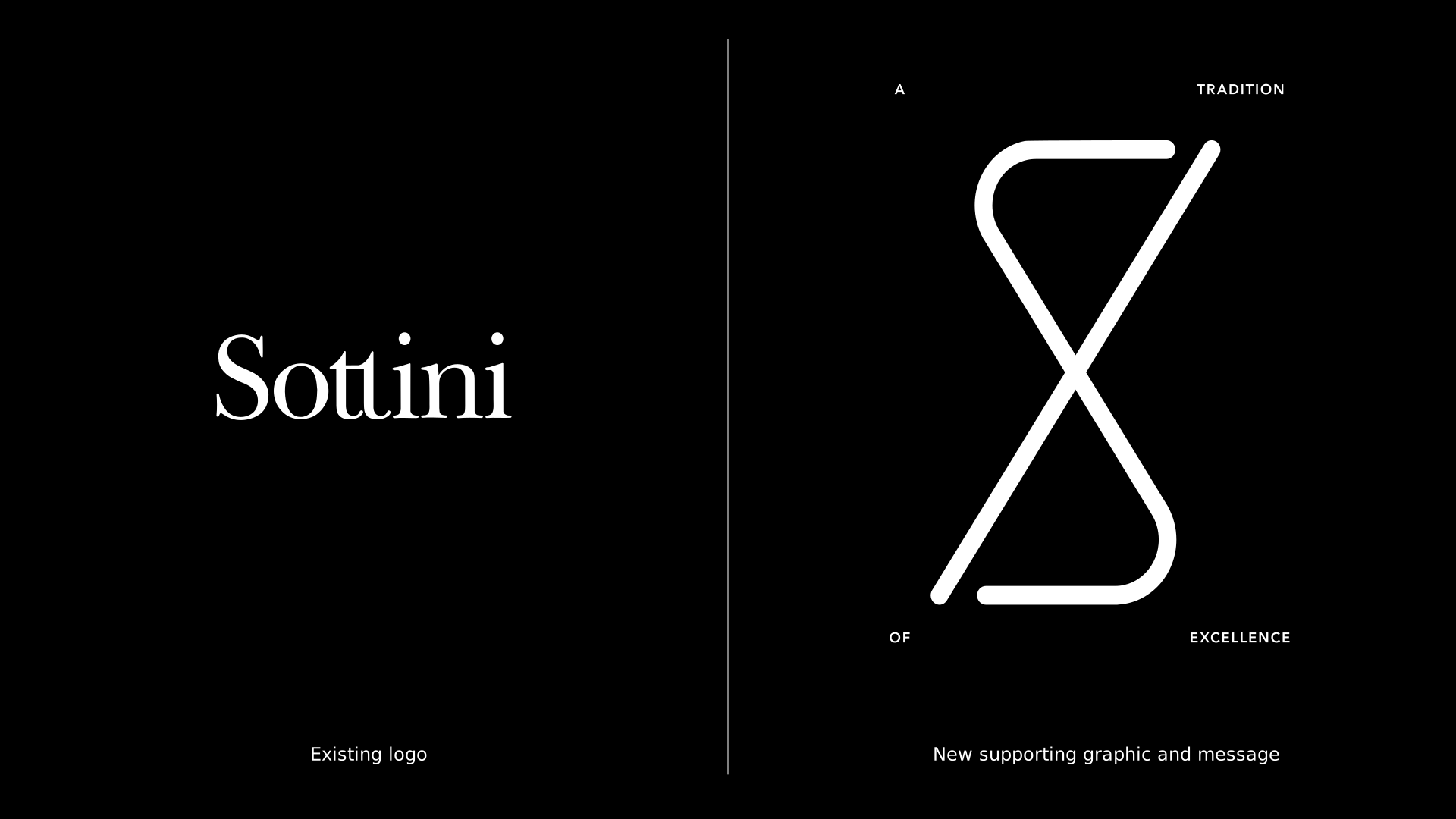
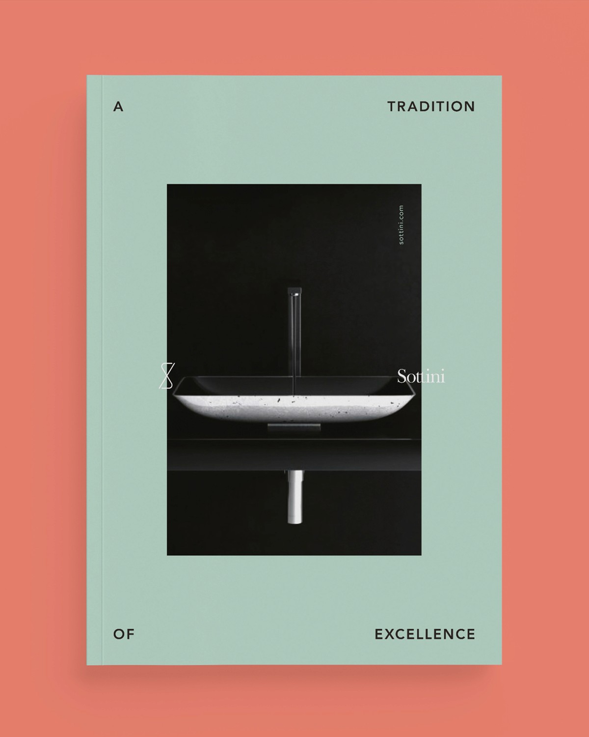
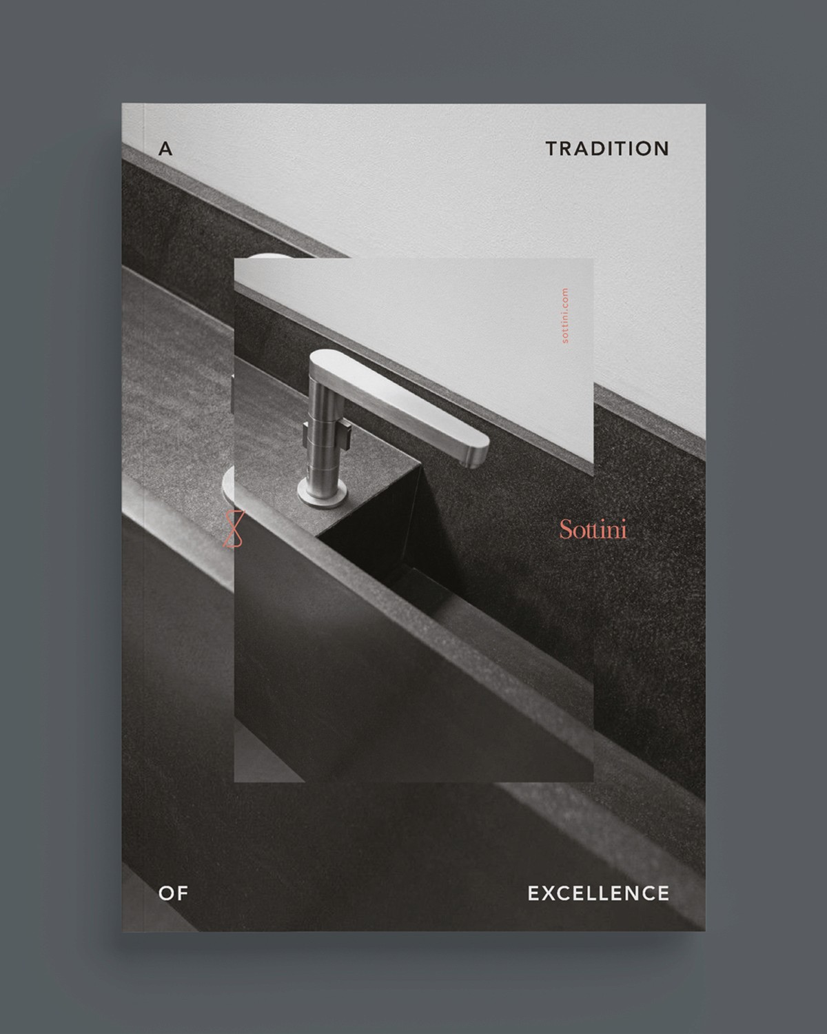
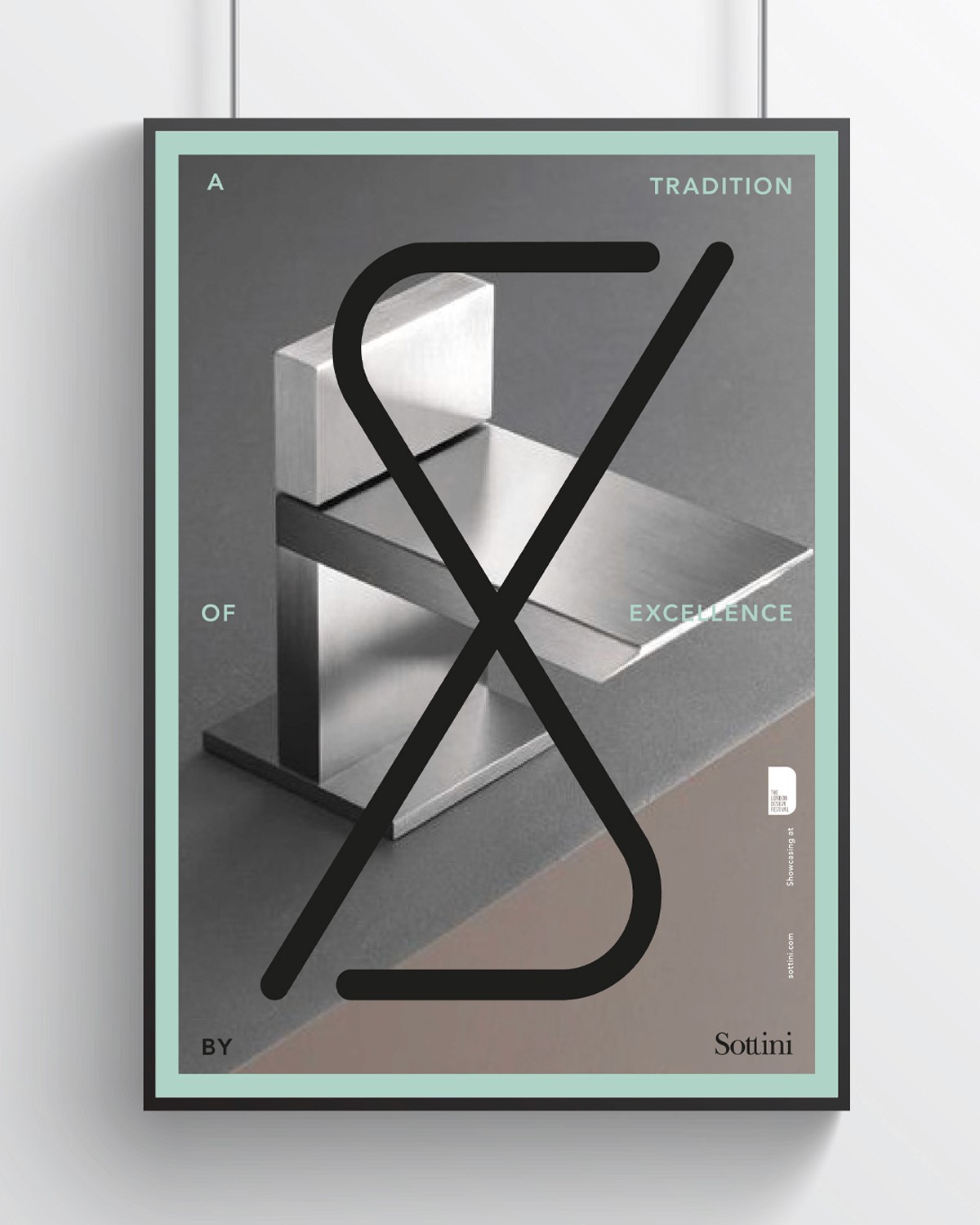
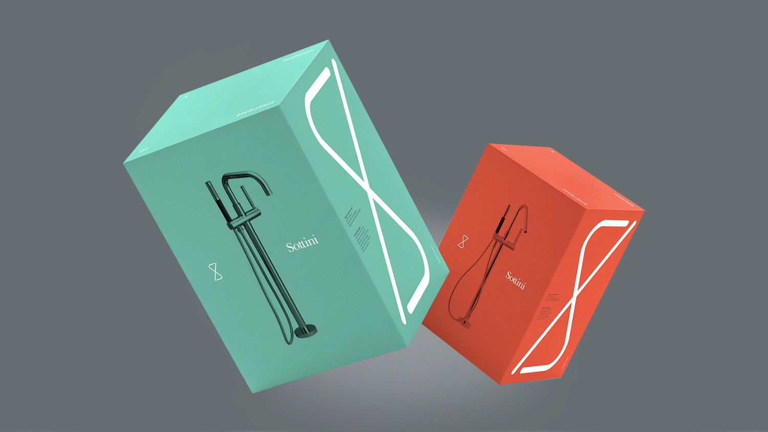
The identity was constructed around architectural permanence rather than trend-led luxury. The 'S' form from the Sottini wordmark was developed into a structural device; not decoration, but a visual framework that creates cohesion across every touchpoint without becoming repetitive or predictable.
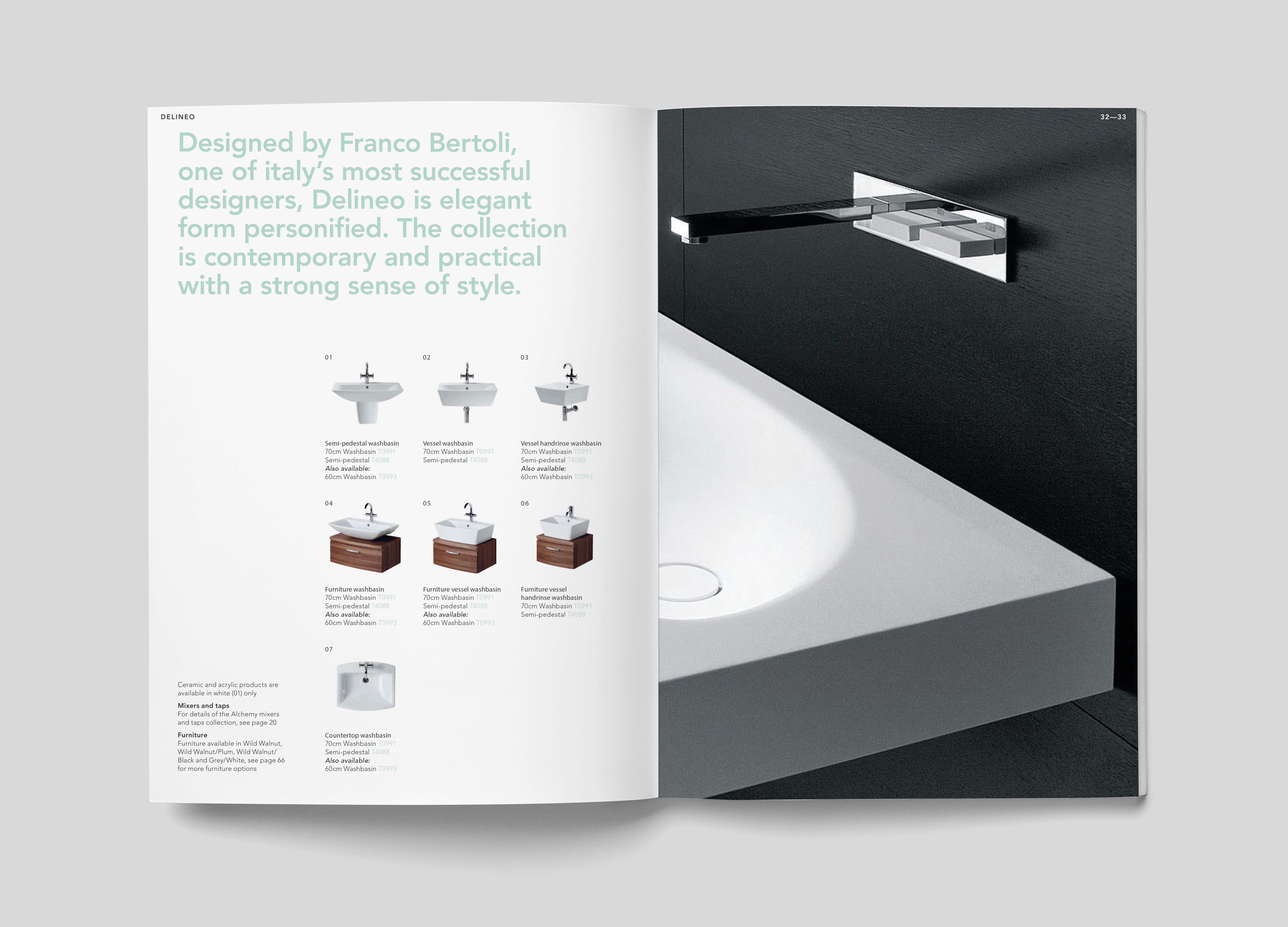
Typography was selected for longevity – a timeless system that signals confidence and craft without relying on fashionable weight or spacing choices that date quickly. The visual language is restrained by design allowing the products to be the centrepiece in every context.
THE OUTCOME
Justify premium pricing in retail and specification environments where Sottini sits beside competitors with larger marketing budgets. The identity had to communicate quality without explanation the kind of visual authority that makes a product feel worth the price before anyone reads a specification.
Sottini is a high-end bathroom brand competing in one of the more difficult premium product categories: design-led home interiors, where differentiation is genuinely hard, margins are squeezed by the volume end of the market, and brand equity is the primary commercial lever available to a premium player.
The brief was to build an identity capable of competing against established luxury bathroom brands in retail environments, digital spaces, and architect/specifier conversations all of which require different registers but must be held together by a single coherent system.
THE CHALLENGE
Premium bathroom brands face a persistent threat: visual trends move faster than product development cycles. A brand built on the current aesthetic of luxury whatever that happens to be is already dating before the product range refreshes.
The risk for Sottini was an identity that looked premium today but required expensive reinvention in three years. The commercial cost of a brand that can't age well is significant for a product business.
THE APPROACH
The identity was constructed around architectural permanence rather than trend-led luxury. The 'S' form from the Sottini wordmark was developed into a structural device; not decoration, but a visual framework that creates cohesion across every touchpoint without becoming repetitive or predictable.
Typography was selected for longevity – a timeless system that signals confidence and craft without relying on fashionable weight or spacing choices that date quickly. The visual language is restrained by design allowing the products to be the centrepiece in every context.
THE OUTCOME
Justify premium pricing in retail and specification environments where Sottini sits beside competitors with larger marketing budgets. The identity had to communicate quality without explanation the kind of visual authority that makes a product feel worth the price before anyone reads a specification.