The Landmark London
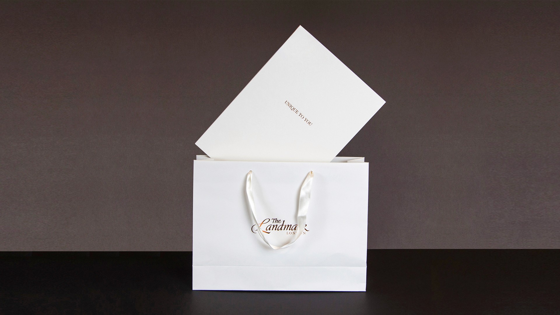
Unique to You

Disciplines
Art Direction
Creative Direction
Photography Guidelines
The Landmark London is one of the capital's most recognised five-star hotels. But prestige alone doesn't fill a wedding calendar. In a London market where couples are comparing venues across a single afternoon of enquiries, the first physical impression the brochure they take away carries serious commercial weight. It has to justify a premium price point before a sales conversation even begins.
The hotel needed their wedding collateral to do what their reputation couldn't do alone, close the gap between a beautiful space and a confident booking decision.
THE CHALLENGE
Luxury at this level is felt before it's understood. A couple considering a five-star wedding isn't just buying a venue they're buying a feeling they'll remember for the rest of their lives. If the materials they hold don't immediately communicate that feeling, the premium price becomes harder to justify. Hesitation enters. Negotiation follows.
The risk wasn't that the hotel wasn't premium enough. The risk was that the printed experience didn't match the lived one.
THE APPROACH
The design direction was built around one principle: restraint signals confidence. Understated luxury, not decoration is what five-star actually looks like in print.
A refined typographic system and generous pacing created space for the venue to speak without overselling it. Photography was art directed to capture natural light, architectural scale, and intimate human moments simultaneously because the brochure needed to hold both the grandeur of the space and the emotion of the occasion in the same frame.
Paper stock and print finishes were chosen deliberately, because the moment someone holds the brochure is itself part of the brand experience. The tactile quality of the object had to match the tactile quality of the venue.
THE OUTCOME
Convert an enquiry into a confident booking, at full rate, without discounting. The brochure needed to remove hesitation at the most critical point in the sales journey when a couple is comparing options and the price is visible but the experience isn't yet real.
The materials also needed to extend the hotel's brand consistently across F&B communications, maintaining the same level of perceived quality across every touchpoint a guest encounters.